Friday 25 October 2013

Carnet de Lettonie - Christophe Blain

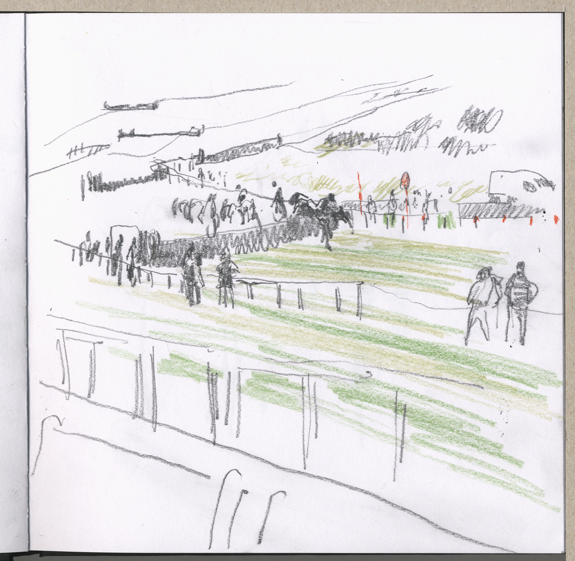
Carnet de Lettonie (Latvia Book) is a 2005 book by the French Bande dessinĂ©e artist Christophe Blain and published by Casterman. It is a document of a journey Blain made to Latvia, told using a mixture of comic sketches and watercolour and line drawings. The drawings are charming and Blain strikes a nice balance between careful observation of a scene or landscape and a more fluent, spontaneous approach: 


My copy of the book is in French and, being under 35 and English, I therefore understood very little of the story until I ran a google translator over it to write this post (I had been happily enjoying the drawings knowing only that it was about a car journey somewhere in eastern Europe.) Blain was invited to a festival in Riga aimed at promoting the image of Latvia abroad and so decided to drive there with his sketchbook - he was accompanied by a guide and translator from the festival - and use the images to make a book. He made two trips in summer and winter, documenting the Baltic landscape of snow-covered forests and wildernesses and the Stalinist architecture of Riga, the port capital. His watercolours are not those of the amateur artist but rather of the comic-book colourist; direct and bold: 


Blain's artwork demonstrates that drawn reportage is often best attempted by comic artists or cartoonists (Searle, Steadman etc) - or at the very least experienced graphic artists whose drawing hand is well-practised. Drawing on location requires being able to express things quickly in shorthand while drawing on a wide-ranging graphic knowledge and technique:


Taking this a stage further, Blain brings his comic-book persona into the book directly, often annotating his drawings with small comic sketches of events (usually depicting himself with red nose streaming in the cold):


Blain's approach - a mix of full sketchbook pages, colour paintings and annotations and notes - might be worth considering in regards to my own work for this project. His book is in large part simply a published sketchbook of an experience of a place - and succeeds largely on these terms. I enjoyed it with no knowledge of what it was about or where and without being able to read the language. The balance of the book, however - the fact that there is more to it than the sketchbook - prevents it at times from becoming monotonous. All these things will be worth considering should I choose to make a small book myself.

Wednesday 23 October 2013

The Showcase - Saturday 19th October

Returning to the racecourse on Saturday, I initially took the blue sky and sunshine to indicate that the weather was not going to live up to the Met Office forecast. The dramatic shadows cast on Cleeve Hill by the gathering clouds suggested otherwise: 


I was determined to work more expansively on Saturday, but in the end the weather had the final say, as I was forced, along with most people, to seek shelter under the stands. I was in the Best Mate stand on Saturday - the cheap tickets but a great view of the course and a different atmosphere. When it started to rain up went the umbrellas over the bookmakers' joints: 


Racing continued despite the weather, but even this had to stop as the entire course disappeared under a grey cloud of driving rain and spray. A clap of thunder and a single bolt of lightning came down from the sky - probably somewhere over Gloucester, but from where I was looking, right behind the Grandstand: 


With the horses spooked and the course invisible, there was nothing to draw but the spectators on either side of me, staring out into the gloom:


But every cloud has a silver lining - in this case a magnificent rainbow that stretched from one side of the course to the other from the members stand to the caravan park. Bob Ross would be proud:


The rain did eventually die down and the punters were happy to escape, mill around and splash in some puddles: 


The Showcase - Friday 18th October

The Showcase was the first day of racing at Cheltenham this season and therefore my first visit to the track as artist reporter! I got there early on Friday 18th to absorb some of the atmosphere before the start and scout out some locations for drawing. I was fully equipped with sketchbook, sandwiches and, most importantly, my fantastic fishing vest loaded with pens, pencils, crayons, watercolours, brushes, ink and, crucially, a dedicated pocket for sharpenings. As this was to be my first day of drawing specifically for the project I had few aims other than to see how I got on and learn through mistakes as much as anything else. Luckily, the weather was good and I was able to make plenty of these as well as some drawings that worked. 

I realised fairly quickly that the racecourse is not going to be an easy place to draw at all by any means:

a) people tend not to hang around in any one location for long
b) there are a lot of people! (there will be more)
c) the place is fairly big and the stands are large - scale considerations esp. re. small sketchbooks
d) horses - fast moving horses!
e) lots of lines - buildings, fences, rails, hedges, hurdles, flags, posts, boxes, vehicles etc - visual furniture

However, this is all good and proper - and after some initially fruitless studies I settled into a rhythm drawing quickly and making decisions - here are some of the results:


This was about the first drawing I did with my fantastic double-headed calligraphy felt pen, which has one fat end and one thinner one. I found this generally much better to work with than the various pencils I had brought with me, as you generally work quicker and more decisively. 

A tall, striking chap dressed in black and a couple of more earthbound punters - who stood watching the second race (out of six) long enough for me to capture them. When I was scanning and clearing up marks etc I added a bit of yellow square - for framing purposes or similar. My sketchbook had very white pages which I'm not sure I like entirely:


Following this I had a bash at a view of the Grandstand during the aftermath of the race as the spectators were thinning out a bit, many of whom had moved on to collect their winnings, visit the paddock, drown their sorrows etc.  I quickly found myself running out of time as people migrated back to view the next race - Strategies will have to be decided upon in the future with this in mind: 


I then dropped some photoshop on this - the grass of the club lawn looks like a blob of green ectoplasm but the trees and shade under the stand works OK I think. When I have time over the next few weeks I plan to experiment with watercolour and some print or stencil ideas for adding colour and working up drawings. I do feel colour adds an awful lot but it is very hard to add on the spot as there is simply not enough space or time. I might experiment with brush pens. Anyhow: 


Back to the paddock and some sketches of horses being led around the ring before the start and various connections watching. I actually enjoyed drawing the horses although I have not had a lot of practise - they are so enormous and impressive they really have to be drawn: 


 I used my brush pens here for the first time during the day on this drawing:  


Getting some form study in, and some sit-down, before the next race on the grandstand steps: 


Sedentary punters: 


More watching race-watching, the only time when people stand still (until they get nervous). I don't think these chaps picked the winner on this occasion, although I'm more hopeful for the one on the left: 


This is a survey of the course from up in the grandstand - lots to look at so I had to simplify dramatically, again using the brush pens: 


 I found using colour on the day quite difficult, but managed to add some grass to this one and the red on the posts. The horse looks a little like he's crashing into the turf. Actually, I'm not sure there were many fallers until the amateur race later in the day. It's quite hard to draw and watch the race at the same time:


The only bookmaker I drew was this chap with the unusual moniker of QUANTUM - they are usually called 'Harry Smith' or 'Tony Gubbins' or something similarly 'welcoming'. By contrast, had I wanted to place a bet, Quantum would have been the last bookie I'd go to. Charitably, I'd say he looked like a horn player from a 1980's ska/crossover band. Uncharitably, I'd say he looked like a crook:


I also drew him packing up his kit at the end of the day:


Some winners, finally - here is the winning amateur jockey of the Fine & Country North Cotswolds Amateur Riders' Handicap Chase, Mr J Bargary. It was his first win in seven starts over jumps. His 
horse was Hunters Lodge, trained by Nigel Twiston-Davies. 


And, at last, someone cheering his horse over the line: 


Tuesday 22 October 2013

Reportager Journal


During my voyages on the interweb I have discovered a very interesting journal - print and online - called Reportager, all about reportage illustration. It is a project in association with the UWE Bristol and also the Topolski Studio in London. I did some work experience at the Topolski Century (as was) back in summer 2012. Since then they have changed in organisation somewhat and are now running a residency for young artists focusing on reportage drawing.

The Reportager website is excellent and they also have an excellent blog, on which there is much more of interest, including - shock horror - a visit to a race meeting (Windsor) by some of the residents at the Topolski studio!

In their own words:

Reportager exists in order to support, initiate, and showcase projects involving drawing as reportage, visual journalism, documentary drawing and illustration as visual essay. We are interested in projects, which use the made image to interrogate a diverse range of themes. The website works as an editorial space for the dissemination of good practice in this area. 
There are good examples of image-makers acting as visual journalists, proactively making work that interests them, documenting either impartially or subjectively on a wide range of issues and locations. We aim to present the very best and innovative examples of visual reportage from around the world and will continue to add new material as it becomes available

I am familiar with the work of Felix Topolski and he has been one of my chief sources of inspiration. Many of the other artists featured on the website are new to me however and have some very interesting approaches to drawn reportage including one digital interactive piece about a court hearing by the Berlin based illustrator Bo Soremsky. Rather like a 'point and click' adventure game, by clicking the mouse over highlighted parts of the drawing the story is told almost as if moving through a virtual courtroom. My German is so rusty that I will not try to translate but it is worth a look for the technique alone (to say nothing for the drawing) as I have never seen anything like this before:

© Bo Soremsky

Both the journal, blog and the Topolski Studio I will do some more research into in the near future as part of this project and perhaps get in touch with some or all of them to see if they would be interested in my work. The interactive technique is also worth further research - although perhaps as part of the Research Experiment rather than FMP as it is an entirely new - and possibly complicated - technique. 

Wednesday 16 October 2013

Literature Festival 2/ The Tent


More sketchbook drawing of the Literature Festival, and also our Small Press Fair in the Uni Glos tent. Again, with some of these drawings I had a go at colouring - the books in the signing I drew really were a lurid, spangly purple colour:


I also put a skyline in behind this page of character studies, and added some colour (again, his jumper really was that green): 


I thought I'd include a photo (not mine) of the festival to compare. I did find that during busy times it was very difficult to draw as people really did move through the thoroughfare very fast: 


These drawings were done in the Cafe, but I rather boshed the composition, and so did a bit of editing, which is possibly interesting: 


Really, this brutal colouring has got to stop. I tried to get the little girl as she shovelled cake into her mouth: 


Finally, drawings of Andrew, Georgina, Iselle, Emma and Andrew again! From our tent: 


Literature Festival/ Symposium

One of the things to emphasise about this project is that it is about drawing people! At a very basic level, achieving a likeness and doing drawings that are Good is going to be centrally important, otherwise everything else will just be a bit of a smokescreen, really. 

I generally put up my more successful efforts on my sketchbook blog: asmalldrawingblog.wordpress.com and one of the things I have discovered is, put bluntly, that if you do manage to achieve a likeness then you have at least achieved something, and people generally appreciate it. Plus: this is even better if you are drawing a famous person - sorry - because obviously people quickly 'get it' or they don't depending on the strength of the likeness. So I had some good feedback from other bloggers for my drawings of Ian Hislop and Andrew Marr at the Literature Festival, including feedback from Mr Marr himself: 


The thing to say here is that, within the world of jump racing there are a number of very famous faces and, since the world is quite a small one, a wide cast of well-known faces and characters. So achieving likenesses here is going to be important. It is, in a way, a bit like the cast of characters here at the university, well known to all inside the circle but, hoho, to fewer without: 


The last one is a bit crazy - I made him look like a beaver man. Again, it is worth stating that there are some occasions where you have too long to draw someone and end up not stopping when you should and go on and make a mess of the drawing. Also, if you know a face reasonably well you are more able to know when to stop - when the drawing has done its job - and you are not working out what someone looks like while you are drawing them quite so much. So in the picture of Kieren watching the symposium I have got him quite well, with a sense of his horror at proceedings, whereas the other two characters are drawn with too much drawing! 

Thoughts: 
1: Know some faces at the races
2: Practice drawing them maybe beforehand?
3: Remember not to draw too much!