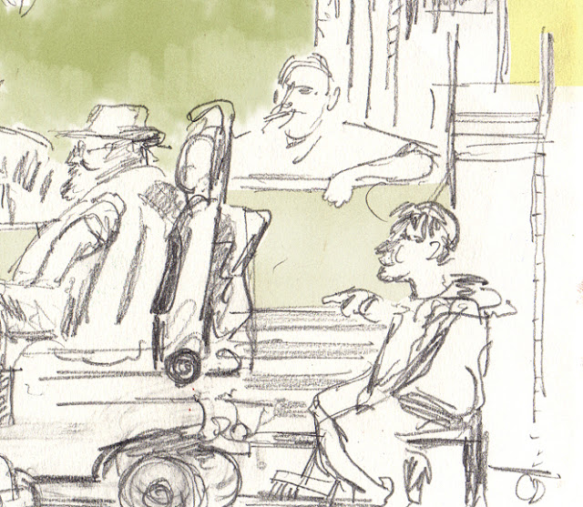
I was digging through some old drawings the other day when I came across this discarded picture of a pet stall in Mitcham, south London, done about two summers ago. First, I coloured the drawing in on the photoshop and then was unfavourably comparing it to a drawing of a similar topic by the illustrator George Butler:
IMAGE GOES HERE WHEN YOU GET A IT
I thought that despite there being a fair bit of detail in my drawing and also some decent character in there is something that doesn't work somehow and it has something to do with composition. The composition is essentially a horizontal rectangle, possibly not very interesting. Butler's has more of a diagonal feel to it.
I decided to try and circumvent this by framing off certain parts of the drawing, to see if reducing the scope and changing the composition would help with how the drawing works. The ones I tried are below:
1: This just takes the side left of the image, like we are looking through a doorway, or perhaps some other market stalls.
2: This cuts out the whole bottom and right and just leaves the stall sign.
3: The two characters I like the most are the two stall hands watching the conversation from the left.
4: This just focuses on the five central figures.
I would say I like 1 and 3; they have a sense of quiet observation to them.
Thoughts:
1: Perhaps try to implement framing during live drawing
2: Have sketchbook pages with frames pre-drawn onto them?


No comments:
Post a Comment